22.04.2024 - ? / Week 1 - Week ?
Teo Mei Hui / 0358315
Advanced Typography / Bachelors of Design (Honors) in Creative Media /
Taylor's University
Task 1
CONTENTS
-
Lectures
-
Instructions
-
Task
-
Feedback
-
Reflection
-
Further Reading
LECTURES
AdTypo_1_Typographic Systems
All designs are based on a structural system. According to Elam, there are 8
major variations with infinite number of permutations:
1. Axial System - all elements are organized to the left or right
of a single axis.
2. Radial System - all elements are extended from a point of focus.
3. Dilatational System - all elements extend from a central point in a
circular fashion.
4. Random System - elements appear to have no specific pattern or
relationship.
5. Grid System - a system of horizontal and vertical divisions.
6. Transitional System -
an informal system of layered banding.
7. Modular System - a
series of non-objective elements that are constructed in as standardized
units.
8. Bilateral System - all text is arranged symmetrically on
a single axis.
.png)
|
|
Figure 1.1 Typographic systems
|
AdTypo_2_Typographic Composition
The Rule of Third
-
A photographic guide to composition. The intersecting lines
are used as guides to place points of interest.
-
Realistically, no one uses it when there are more favorable options.

|
|
Figure 1.2 Rule of Thirds
|
Typographic Systems
-
Grid System remains popular due to the versatility of system and its
modular nature allows an infinite number of adaptions

|
|
Figure 1.3 Grid Systems "how to"
|
Environmental Grid
-
This system is based on the exploration of an existing structure or
numerous structures combined.

|
|
Figure 1.4 Environmental Grid
|
Form and Movement
- This system is based on the exploration of an existing grid system.

|
|
Figure 1.5 Form and Movement
|

|
|
Figure 1.6 Form and Movement
|
Ad_Typo_3_Context & Creativity
Handwriting
-
We study handwriting because the first mechanically produced letterforms
were designed to directly imitate handwriting.
-
It would become the basis for form, spacing and rules mechanical type
would try and mimic.
Cuneiform (c. 3000 B.C.E.)
- earliest system of actual writing
- evolved from pictograms
- written from left to right
Hieroglyphics (2613-2160 B.C.E.)
- Egyptian writing system fused with art of relief carving
- used as ideograms, represent the things they actually depict.
-
used as determinatives to show that the signs preceding are meant as
phonograms and to indicate the general idea of the word.
-
used as phonograms to represent sounds that "spell out" individual
words.
Early Greek (5th c. B.C.E.)
- built on Egyptian logo-consonantal system
- phonetic alphabet consisting of 22 letters
- drawn freehand, and had no serifs
-
over time the strokes of these letters grew thicker, the aperture
lessened, and serifs appeared
Roman Uncials
- by the 4th century Roman letters became more rounded
- curved form allowed less strokes and can be written faster
English Half Uncials (8th C.)
-
the uncial evolved into a more slanted and condensed from in England
Carolingian Minuscule
-
book production increased and language was standardized during
Charlemagne's patronage
-
capitals at the start of a sentence, spaces between words and
punctuation
- used for all legal and literary works
- became the pattern of Humanistic writing in the 15th century
Black Letter (12-15 C. CE)
-
Gothic was the culminating art expression of the middle century
(1200--1500)
-
characterized by tight spacing and condensed lettering, which reduced
the amount of costly materials in book production
- evenly spaced verticals dominated the letterform
The Italian Renaissance
-
the renaissance embrace ancient Greek and Roman culture spurred
creativity in Italian art, architecture, literature, and letterform
design
- the newly rediscovered letterforms were named Antica

|
|
Figure 1.7 Writing System and Letterforms through the ages
|
Movable Type
-
printing on wood block had already been practiced in China, Korea and
Japan
- earliest known printed book is the Diamond Sutra (AD 868)
- pioneered in China but achieved in Korea (Diamond Sutra)

|
|
Figure 1.8 Movable Type
|
Indus Valley Civilization (IVC) script (3500-2000 B.C.E.)
- the oldest writing found in the Indian subcontinent
- yet undeciphered, seems to be logo-syllabic in nature

|
|
Figure 1.9 Indus Valley Civilization script
|
Brahmi Script (450-350 B.C.E.)
-
the earliest writing system developed in India after the Indus script
-
one of the most influential writing systems, all modern Indian scripts
and several hundred scripts found in Southeast and East Asia are derived
from Brahmi

|
|
Figure 1.10 Brahmi Script
|
AdTypo_4_Designing Type
1. Xavier Dupré (2007) suggested two reasons for designing a
typeface:
-
typeface carries social responsibility so one must continue to improve
its legibility
- type design is a form of artistic expression
2. Adrian Frutiger, a renowned twentieth century Swiss graphic
designer:
-
his forte was typeface designing and he is considered responsible for
the advancement of typography into digital typography
- valued contribution to typography: Univers and Frutiger
-
purpose of Frutiger font: a clean, legible, and distinctive typeface
that can be seen close-up or faraway, extremely functional
-
considerations/limitations for Frutiger font: letterforms needed to be
recognized in poor light condition or fast reading speed
-
he tested with unfocused letters to see which could still be identified

|
|
Figure 1.11 Univers (left), Frutiger (right)
|
3. Matthew Carter
-
son of Harry Carter, Royal Designer for Industry, contemporary British
type designer and ultimate craftsman
-
many of his fonts were created to address specific technical
challenges, such as Verdana (1996) for Microsoft
-
purpose: fonts were tuned for extreme legibility at very small sizes
on screens due to the rise of the internet and electronic devices
-
considerations/limitations: Verdana fonts exhibit characteristics
derived from pixels rather than traditional tools like the pen, brush,
or chisel
- commonly confused characters: i, j, l

|
|
Figure 1.12 Verdana 'a'
|
4. Edward Johnston
-
creator of hugely influential London 'Underground' Typeface: Johnston
Sans
-
he was asked to create a typeface with bold simplicity that was modern
yet rooted in tradition
-
purpose: London's Underground railway ordered a new typeface for
its posters and signage from calligrapher Edward Johnston
-
considerations/limitations: to unite the London Underground Group (all
the different companies using the same rails and tunnels), he applied
Roman capitals proportion so it is rooted in traditional calligraphy,
but still has elegance and simplicity to fit the modern age

|
|
Figure 1.13 Earlier version of Johnston Sans
|
General Process of Type Design
1. Research
-
we should understand type history, type anatomy and type conventions
-
determine the type's purpose and what applications it will be used in
-
examine existing fonts for inspiration, ideas, reference, context, and
usage patterns
2. Sketching
-
sketch using traditional toolset: more confidence with their hands,
better control
-
sketch using digital toolset: quicker, persistent and consistent, but
impede natural movement of hand strokes
3. Digitization
-
leading professional software for font digitization: FontLab and Glyphs
App
-
using Adobe Illustrator to design or craft letterforms first (frowned
upon by purists)
-
attention should also be given to counter form, as readability is
dependent on it
4. Testing
- important component of design thinking process
- process of refining and correcting aspects of the typeface
-
readability and legibility of typeface becomes an important
consideration (unless it's a display type)
5. Deploy
-
even after deploying, there will still be teething problems that did not
come fore during testing phase, the task of revision does not end here
INSTRUCTIONS
TASKS
Exercise 1: Typographic Systems
Explore the 8 typographic systems using using the provided content in
Adobe InDesign.
PROCESS
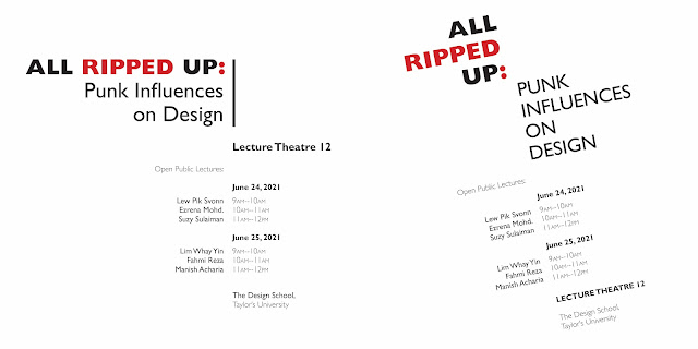
Axial
For the first attempt, I placed the title on the left side of the axis,
and split the different texts groups on either sides, while playing with
the font styles, I also added graphical elements beside the title.
For the second attempt, I split the title into two sides of the axis,
changed the position of some of the text groups, and then slanted the
entire axis. I like the second one better as there is more balance and
dynamism with the slant.
|
|
Figure 2.1 Axial system attempt, week 1 (22/04/2024)
|
Radial
For the first attempt, I tried with only one point of focus first, I added
graphical elements so that there is less negative space. For the second
attempt, I added two point of focus at opposite corners, having the title
extend from one end and the texts from the other end, I made sure to utilize
graphical elements, colors and sizing up certain words so that it doesn't look
too simple. I like the second attempt as there is more balance.

|
|
Figure 2.2 Radial system attempt, week 1 (22/04/2024)
|
Dilatational
For this system, I tried to balance how the body texts were placed on opposing
sides. It ended up looking like a flower. I adjusted the color and sizing of
the fonts so that it does not look bland.

|
|
Figure 2.3 Dilatational system attempt, week 1 (22/04/2024)
|
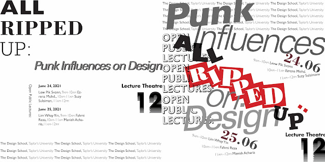
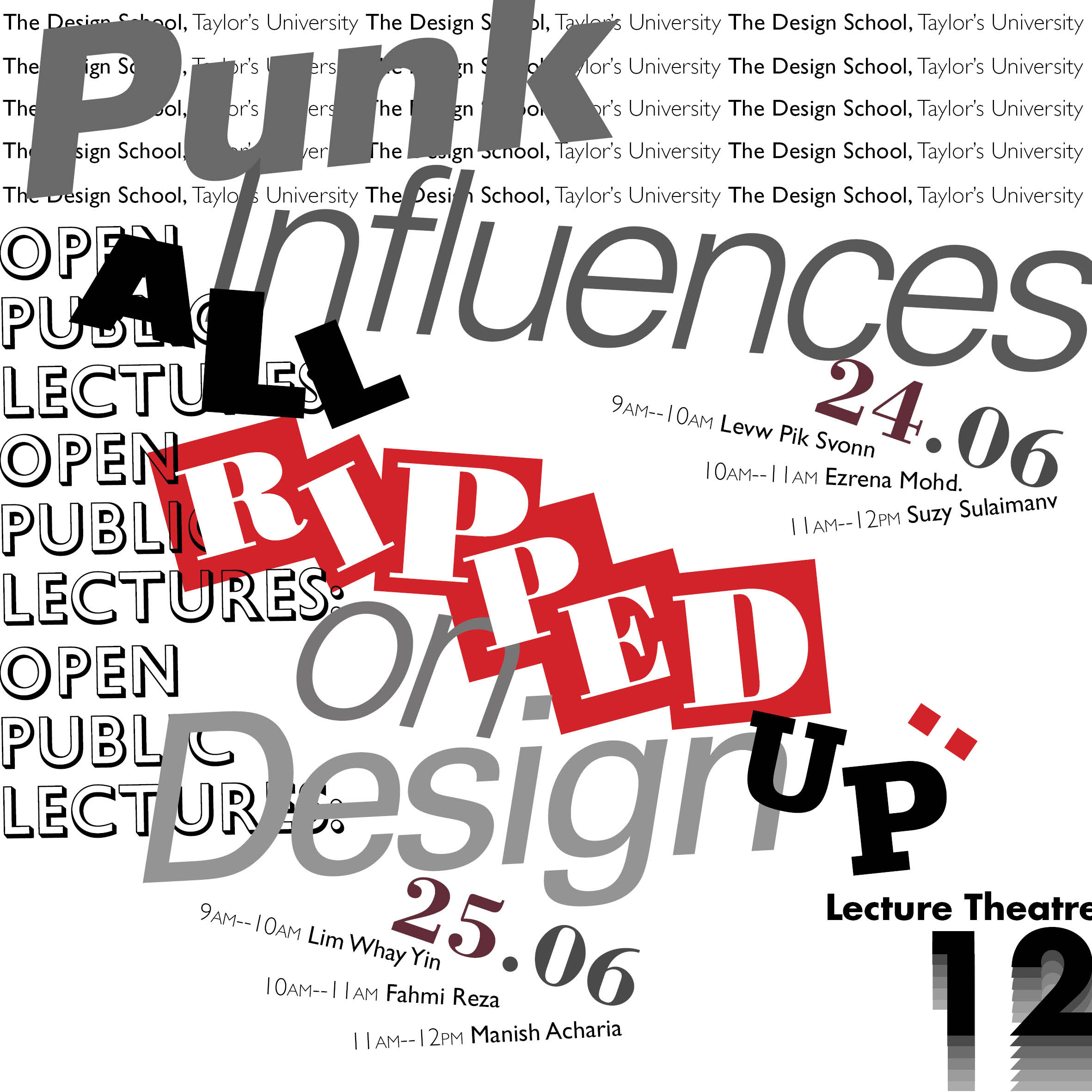
Random
This one was the hardest to grasp because the guideline is that there is no
guideline. We had to make it look random but still legible in a way. My
first attempt does not look random at all, all I did was play around more
with the fonts, it looked too rigid. For the second attempt, I made the
individual letters in 'all ripped up' have different fonts, sizes and
angles, and then made the font style and color different for each word in
'punk influences on design'. As for the rest, some body texts were repeated
many times and some were placed in weird angles. This was a fun system to
explore.
|
|
Figure 2.4 Random system attempt, week 1 (22/04/2024)
|
Grid
For the grid system, I started by creating guidelines to make the grids. Then
I played around with the placements of the title and texts. The first attempt
ended up looking a little like axial, with almost all of the text aligned to
the middle line. During the second attempt I tried not to make the same
mistakes by trying to spread them out more.

|
|
Figure 2.5 Grid System process, week 1 (22/04/2024)
|

|
|
Figure 2.6 Grid system attempt, week 1 (22/04/2024)
|
Transitional
The first attempt i went with straight lines but
slanted some of them, but it looked kind of boring. For the second attempt
I tried to make the curves similar so that it does not look messy. I also
created like an intersection between the title and some texts. The second
one is definitely better as there is more movement and dynamism.

|
|
Figure 2.7 Transitional system attempt, week 1 (22/04/2024)
|
Modular
For the modular system I started by creating guidelines. I then tried to
fit the title and texts into 'blocks' and then played around with the
layout. The first and second attempt are just different positioning using
the same 'blocks'.

|
|
Figure 2.8 Modular system process, week 1 (22/04/2024)
|

|
|
Figure 2.9 Modular system attempt, week 1 (22/04/2024)
|
Bilateral
For the bilateral system, I made all the titles and texts center-aligned,
then placed them along the center axis. I changed the color and font
styles for certain texts as well as added line elements to make it more
interesting.

|
|
Figure 2.10 Bilateral system attempt, week 1 (22/04/2024)
|
Compilation
.jpg)
|
|
Figure 2.11 Compilation of 8 typographic systems, week 2
(29/04/2024)
|
FINAL

|
|
Figure 2.12 Axial system final JPEG, week 2 (29/04/2024)
|

|
|
Figure 2.13 Radial system final JPEG, week 2 (29/04/2024)
|

|
|
Figure 2.14 Dilatational system final JPEG, week 2 (29/04/2024)
|

|
Figure 2.15 Random system final JPEG, week 2 (29/04/2024)

|
|
Figure 2.16 Grid system final JPEG, week 2
(29/04/2024)
|
|

|
|
Figure 2.17 Transitional system final JPEG, week 2 (29/04/2024)
|

|
|
Figure 2.18 Modular system final JPEG, week 2 (29/04/2024)
|

|
|
Figure 2.19 Bilateral system final JPEG, week 2 (29/02/2024)
|
Figure 2.20 Typographic systems final PDF, week 2 (29/04/2024)
Figure 2.21 Typographic systems final PDF - with grids, week 2
(29/04/2024)
Exercise 2: Type & Play
Part One: Finding Type
Select an image of a man-made object, structure, or something from
nature. Then, analyze, dissect, and identify potential letterforms in
the image. Explore and digitize the letterforms, but ensure the core
features of its origins are maintained.
1. Chosen Picture
I took some time on the internet to find an interesting picture where I
can extracted letterforms from. I hesitated between butterfly wings,
jellyfish and spider lily flowers. In the end I went with the flowers as
i could easily identify potential letters.

|
|
Figure 3.1 Chosen picture - spider lily flower, week 3
(04/05/2024)
|
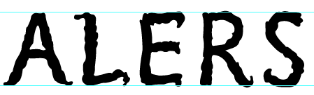
2. Letterform Extraction
I traced out the letters that I can identify from the petals of the
flower, which are A,L,E,R,S. Using the pen tool, I made sure to keep the
details of the curved petals.

|
|
Figure 3.2 Traced letters - A,L,E,R,S, week 3 (04/05/2024)
|

|
|
Figure 3.3 Extracted letterforms - A,L,E,R,S, week 3
(04/05/2024)
|
3. Sketches
I sketched out how I imagined the final
letterforms would look like. The top sketch is based on sans serif
typeface and the bottom sketch is based on serif typeface.

|
|
Figure 3.4 Font sketches, week 3 (04/05/2024)
|
4. Reference
I decided to use Gill Sans as my reference font, as I wanted to go with
the sans serif sketch.

|
|
Figure 3.5 Reference font - Gill Sans, week 3 (04/05/2024)
|
5. Digitization
First, I used direct selection to move the anchor points so that the
extractions would resemble actual letters more.

|
|
Figure 3.6 Adjusting extraction into letters, week 3
(04/05/2024)
|
Then, I traced my sketch so that the stems can be straightened.

|
|
Figure 3.7 Straightening the stems, week 3 (04/05/2024)
|
Moving on, I made sure to align the cap height and baseline of all
the letters.

|
|
Figure 3.8 Aligning cap height and baseline, week 3 (04/05/2024)
|
Then i made minor adjustments to some parts of the letters so that
there is more consistency throughout the letters. Such as refining the
curvy edges, especially in 'A' while making it more symmetrical. I also
adjusted all the letters while referring to the reference type that I
chose.

|
|
Figure 3.9 Final refinement to ensure consistency, week 3
(04/05/2024)
|
FINAL

|
|
Figure 3.10 Process compilation, week 3 (04/05/2024)
|

|
|
Figure 3.11 Initial extraction vs. final refinement, week 3
(04/05/2024)
|

|
Figure 3.12 Final letterform, week 3 (04/05/2024)
|
Figure 3.13 Exercise 2 - Final Finding Type (PDF), week 3
(04/05/2024)
Part Two: Movie Poster
Create a movie poster in the dimension of 1024×1024px, using the typeface
we designed in part one.
Process
I chose the picture of a woman holding a red spider lily flower, as i
thought it had a more cinematic feel to it. I adjusted the original image
so that the colors are darker. I made my typeface gold to go with the
picture. However, this poster was rejected because the woman was taking
too much attention away from the spider lily flower.

|
|
Figure 3.14 Movie poster 1st attempt, week 4 (13/05/2024)
|
I tried out two different pictures as background. The first one, I
made my typeface gradient, following the colors of the flower in the
picture. For the second one, I used red and turquoise, as it is a
contrasting color. It looks nice but the readability was a little low. So I
went with the first option as it was safer.

|
|
Figure 3.15 Movie poster 2nd attempt, week 4 (13/05/2024)
|
Final

|
|
Figure 3.16 Final movie poster, week 4 (13/05/2024)
|
Figure 3.17 Final movie poster (PDF), week 4 (13/05/2024)
FEEDBACK
Week 2
Specific Feedback:
E-portfolio: compile all images into
one so that post doesn't get too lengthy, also make sure embedded items
are viewable to other people.
Typographic systems: Axial system - left layout is more interesting as
there is a slant. Radial system - which one I prefer (right layout because
more balanced). Dilatational - pay attention to the kerning. Random system
- it's almost there. Grid system - it's okay, no other choices.
Transitional system - which one I prefer (right because more movement and
dynamism). Modular system - it's okay, no other choices. Bilateral system
- it's okay, no other choices.
General feedback:
Always keep up with the tasks, so you don't
have too much work piled up near submission. Update further reading.
Week 3
Specific feedback:
My typeface is good, the process is
correct, just need to make sure baseline and cap height are aligned, and
some minor edits and I'm good to go.
General feedback:
Make sure font has consistent weight for all
letters. Complete all the exercise and lecture notes.
Week 4
Specific feedback:
Poster: Too much focus is taken away by the face, it should focus on the
type, advised to to crop out the face and leave only the lips to chin
area. Credits are too big, causes too much disturbance. Change the
picture, the extractions are from flowers, not human.
General feedback:
Ensure you never have rivers in paragraphs. Try to look for
opportunities of interplay or integration between font and poster. It's
okay to make mistakes or wrong decisions, marks don't matter much as
long as you learn something. Try to be confident in your own decisions
and judgements.
REFLECTIONS
Experience
In exercise one, I was able to explore the 8
typographic systems, which are axial, radial, dilatational, random, grid,
transitional, modular, bilateral. The systems provided us guidelines on how
the to organize the texts, it was fun but challenging as I had to squeeze my
brain to think of many layouts. In exercise two, I extracted letterforms
from a picture of spider lily flowers, then I continuously refined the
extraction and created a consistent typeface that still shows the core
features of the flowers. After completing the typeface, I created a movie
poster to showcase the typeface. I had to change the background image
several times to ensure legibility. I also played around with the colors and
effects so that the fonts integrates with the background image.
Observations
Each typographic systems have a unique way of
organizing text, which influences visual hierarchy and readability. Some are
more structured and rigid, such as axial and bilateral, which offers more
clarity, while some are more playful, such as radial and random, which
allows more freedom and creativity. Extracting the letterforms requires the
utmost patience, as it is an iterative process of refining a crude form into
a legible font. While making a movie poster, it is important that all the
texts and elements interplays together so that there is visual
harmony.
Findings
I realized that each typographic system has different
strength and purpose, some offer more clarity while some displays
creativity. Through extracting letterforms from a picture, I realized that
art can be found everywhere, as long as you discover it and refine it in
your own ways. While creating movie posters, I learned making sure the
typography and visual elements complement each other is crucial in order to
create good design.
FURTHER READING

|
|
Figure 4.1 Typography Referenced
|
Typographic Principles by Jason Tselentis
Good typographic expression is an art, but it is also based on
principles.
Format
Designers first take note of the size and proportion of the page or screen
in which they will work. And although every format has edged boundaries
that contain design elements, that shouldn’t limit creative opportunities.
Typographic Selection
One of the best methods to decide which typeface to use is to have a clear
understanding of its application. Will the type be digital or in print?
Will it require a range of weights and postures? If it requires a variety
of fractions and numerals, does the typeface have a complete set of
OpenType options for numbers? While every typeface has a distinct look and
feel, its application ultimately dictates its usefulness.
Text Type
-
designed for uninterrupted reading - Caslon, Bembo, Garamond
- newspaper typeface - Times New Roman
- clear readability - Clear-face, Centaur, Sabon
Display Type
- needs to quickly catch readers’ attention
- using typographic size to gain attention continues to this day
-
Rockwell, Memphis, Clarendon all have enough weight and character for
use as display type in headlines or subheads.
Reading Direction and Scanning
Western cultures read the written language from left to right, which typically
puts the reader’s first glance at the upper left-hand corner of formats. From
there, readers scan left to right, diagonally down to the next line, and back
again from left to right. This Z-shaped scanning pattern often occurs when
reading text type in magazines or books, as well as with digital media such as
content found on the Internet.
Focal Point
-
dynamic compositions often employ a focal point that does not allow a
reader to scan starting with the top-left corner
-
the designer takes control, telling the reader what to read first on the
format
.png)


.jpg)


.jpeg)
.jpeg)
Comments
Post a Comment