Advanced Interactive Design - Task 2: Interaction Design Planning and Prototype
19.05.2025 - 13.06.2025 / Week 5 - Week 8
Teo Mei Hui / 0358315
Advanced Interactive Design / Bachelors of Design (Honors) in Creative Media / Taylor's University
Task 2: Interaction Design Planning and Prototype
CONTENTS
INSTRUCTIONS
TASK
- Walkthrough Video presenting the plan and showing the animation examples and/or references.
- Online posts in your E-portfolio as your reflective studies with links to any resource involved in the creating of the plan. (i.e.: Figma link, Miro link, etc.)
FEEDBACK
- Layout too messy and inconsistent. Take a look at the good websites and notice how there's a certain consistency, the layout doesn't fly around.
REFLECTIONS
This task allowed me to explore how storytelling, emotion, and design come together to create a meaningful user experience. Since I chose a topic I’m genuinely interested in — Natasha Romanoff’s life — I stayed more engaged and motivated throughout the process. It felt more than just designing a website; it felt like building a tribute to her character.
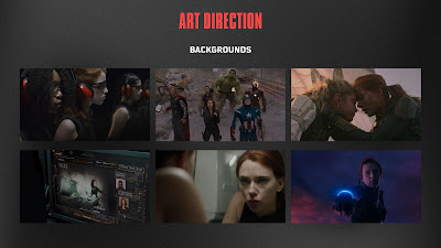
As I planned each chapter, I focused not only on the storyline but also on the emotional pacing — thinking about what the user should feel and when. I spent a lot of time illustrating and choosing visuals that matched the tone of each chapter. Finding the right images took patience, especially making sure they were high-quality and consistent with the cinematic theme. It was important that everything matched visually — from the color scheme to the style — so the experience would feel cohesive.
Looking through award-winning interactive websites really inspired me. I noticed how even subtle visual elements and movement could make a moment more powerful. This made me more intentional with my choices, and helped me see how design can tell a story beyond words.
Overall, this process taught me that building an interactive experience means balancing creativity, emotion, and consistency — and that the details, no matter how small, make all the difference.
.jpeg)
.jpg)


.jpeg)
.jpeg)
Overall design looks okay. Some screen design looks inconsistent with the overall concept. The placement of the 2 buttons that has a small window open is unclear unless you have a background that points to something related to the content. You might want to maintain the header or title for each screen also so that the user knows where they are
ReplyDelete