19.05.2025 - 08.06.2025 / Week 5 - Week 7
Teo Mei Hui / 0358315
Application Design II / Bachelors of Design (Honors) in Creative Media /
Taylor's University
Task 2: Interaction Design Proposal & Planning
CONTENTS
-
Instructions
-
Task
-
Feedback
-
Reflections
In Task 2, the focus shifted towards refining the interaction design
through the creation of detailed user flow diagrams and wireframes. This
stage was essential for mapping out the structure and navigation of the
mobile application, ensuring a smooth and intuitive user journey.
Additionally, this task laid the groundwork for implementing animations that
contribute to a more engaging and user-friendly experience.
Flowmap
For this stage of my
Moovit app redesign, I began
by developing a detailed
user flow map, which is a visual diagram
outlining how users move through the app and interact with key features. This
helped clarify the structure, hierarchy, and logic behind screen transitions
and navigation. Creating the flow map ensured that each user interaction felt
purposeful and contributed to a smooth, intuitive journey from start to
finish.

|
|
Figure 1.1 Overview of Moovit App Flowmap
|
Masterplan
Next, I developed a comprehensive
animation masterplan that
outlined how animations would be used across three phases:
-
onboarding: the
initial experience upon launching the app
-
in-app: animations
used during daily interaction
-
offloading: animations during task completion or app exit
This masterplan served as a design blueprint, helping me decide where
animations could enhance usability, provide feedback, or strengthen the
app’s visual identity without overwhelming the user.
 |
| Figure 2.1 Moovit App Animation Masterplan |
Animation Prototype
Finally, using the flow map and masterplan as a guide, I moved on to
animation prototyping. I used
Figma to design and prototype
the core interactions, including both
micro animations (such as
button feedback, loading spinners, and hover states) and
macro animations (like
screen transitions and modals). To elevate the onboarding experience, I also
used Adobe After Effects to
animate the app’s logo—adding a dynamic visual element that introduces the
brand with impact. These animations were refined and integrated into the
prototype, supported by visual and written explanations describing how they
enhance user engagement and reinforce the app’s design language.
Macro Animations:
-
Animated logo pops up in the center
-
App name fades in
-
Onboarding content fades in

|
|
Figure 3.1 Loading screen animation
|

|
|
Figure 3.2 Moovit logo animation in After Effects
|
Macro Animations:
-
Slide left/right when press 'Next' or 'Back'
Micro Animations:
- Dots at the bottom indicate page number

|
Figure 3.3 Onboarding screen animation
|
Macro Animations:
- Slide up during onloading

|
Figure 3.4 Login page screen animation
|
Macro Animations:
-
Background and each section fades in one by one.
Micro Animations:
-
Swiping on carousel cards will cause it to slide to another card different suggestions
-
The larger dot slides to indicate card number
|
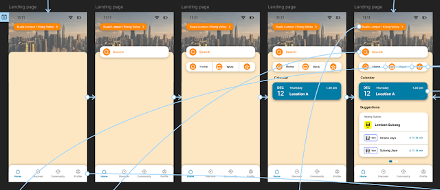
Figure 3.5 Landing page animation
|

|
|
Figure 3.5 Carousel cards on landing page
|
Macro Animations:
-
Map background is already on screen instantly.
-
Buttons and search section slide up from bottom with background panel.
-
Filter bar and route suggestions fade in accordingly.
Micro Animations:
- Start location and destination switches when switch button is pressed.
- Pressing the ‘favourites’ or ‘depart:now’ buttons will trigger an overlay to slide up from the bottom, with the background darkened to emphasise new area.
- Pressing the filter tab button triggers sliding transitions and changes the result order.
- Filter tab button turns dark on click/selection.
- Vertical scrolling behavior for suggested routes

|
|
Figure 3.5 Journey Planning page animation
|

|
|
Figure 3.6 Journey Planning page - filter bar animation
|
|

|
|
Figure 3.7 Journey Planning page - overlays and other pages
|
|
Macro Animations:
-
Map background is already on screen instantly.
-
Instructions panel slide up from the bottom.
Micro Animations:
- Vertical scrolling behavior for direction cards
-
Pressing the buttons will trigger an overlay to slide up from the bottom, with the background darkened to emphasise area.

|
|
Figure 3.8 Directions Preview page animation
|
Macro Animations:
-
Map background is already on screen instantly.
-
Direction cards slide up afterwards.
Micro Animations:
-
Pressing the round buttons and lined buttons will trigger an overlay to slide up from the bottom, with the background darkened to emphasise new area.
-
Swipe the direction cards to look at next instructions.
-
The larger dot slides to indicate card number
-
Vertical scrolling behavior for longer cards.
-
When swipe to last card, ‘Stop’ button will transition into ‘arrived’ button with tick icon that have slight stretch animation.

|
Figure 3.9 Live Directions page animation
|

|
|
Figure 3.10 Directions Preview & Live Directions page - overlays
|
Discover Page - Recent Tab
Macro Animations:
-
Map background immediately fade in.
-
Search and navigation bar section slide up from bottom with background panel.
-
Results fade in accordingly.
Micro Animations:
-
Pressing ‘Clear’ or ‘cross’ icon will trigger an overlay to slide up from the bottom, with the background darkened to emphasise new area.
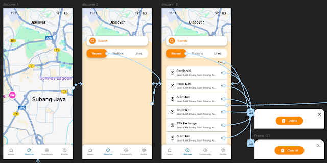
|
|
Figure 3.11 Discover Page - Recent Tab animation
|
Discover Page - Stations & Lines Tab
Macro Animations:
-
Background and search section remains from previous page.
-
Filter bar and results fade in.
Micro Animations:
-
Pressing the filter tab button triggers ease in and ease out transitions and changes the results.
-
Filter tab button turns dark on click/selection.

|
Figure 3.12 Discover Page - Stations Tab animation
|

|
Figure 3.13 Discover Page - Lines Tab animation
|
Macro Animations:
-
Map background is already on screen instantly.
-
Station panel slide up from bottom.
Micro Animations:
-
Pressing the round buttons will trigger an overlay to slide up from the bottom, with the background darkened to emphasise new area.

|
|
Figure 3.14 Stations Page - Lines Tab animation
|
Station in a Line - Preview
Macro Animations:
-
Map background is already on screen instantly.
-
Lines panel slide up from bottom.
Micro Animations:
-
Pressing the outlined buttons will trigger an overlay to slide up from the bottom, with the background darkened to emphasise new area.

|
|
Figure 3.15 Station in a Line - Preview page animation
|
Station in a Line - Live View
Macro Animations:
-
Map background is already on screen instantly.
-
Direction cards slide up afterwards.
Micro Animations:
-
Pressing the buttons will trigger an overlay to slide up from the bottom, with the background darkened to emphasise new area.

|
Figure 3.16 Station in a Line - Live View page animation
|
Macro Animations:
-
Orange background immediately fade in.
-
Search and results panel slides up afterwards.

|
Figure 3.17 Community page animation
|
Macro Animations:
-
Background and profile info immediately fade in.
-
All section fades in at once afterwards.
-
Pressing any section triggers transition animation that slides right or up to the next page.
Micro Animations:
-
Pressing ‘more’ on Favourites page will trigger an overlay to slide up from the bottom, with the background darkened to emphasise new area.

|
Figure 3.18 Profile page animation
|
Final Submission
Flow Mapping & Masterplan
Figma File
Figma Prototype
Presentation Video & Slides
Application Design 2 - Task 2
N/A
Working on Task 2 challenged me to think beyond just aesthetics and focus
deeply on how users actually interact with a mobile app. Starting with the
user flow map gave me clarity on the overall navigation and helped me step
into the mindset of the user. It was a reminder that good interaction design
isn’t just about looking nice—it’s about making the journey feel effortless
and intuitive.
Creating the animation masterplan was a crucial step in tying everything
together. It helped me approach animations not as decorative extras, but as
meaningful elements that support and guide user behavior. Breaking the
experience into onboarding, in-app, and offloading stages allowed me to
design with intention at each phase of the journey. I realized how strategic
animation placement can enhance not only usability but also brand
perception.
Prototyping the interactions in Figma and bringing the logo to life in After
Effects gave me hands-on experience with tools that professional designers
use. It was rewarding to see how even small micro animations could elevate
the user experience by making interactions feel more responsive and
polished. Overall, this task taught me how detailed planning, thoughtful
motion design, and consistent execution can transform an app from functional
to delightful. I feel much more confident in my ability to design
user-centric interactions and am excited to carry these skills into future
projects.
.jpeg)


.jpeg)
.jpeg)
Comments
Post a Comment